bondar.design
so, we are loading
DESIGN RESEARCH
UX
DESIGN SYSTEMS
UI
DESIGN OWNERSHIP
Background in industrial and graphic design. Mentoring and teaching designers. Leading design initiatives across B2B and B2C solutions for Mobile and Desktop products
In this projects I worked with two mobile apps:
Detailed case studies:
.avif)
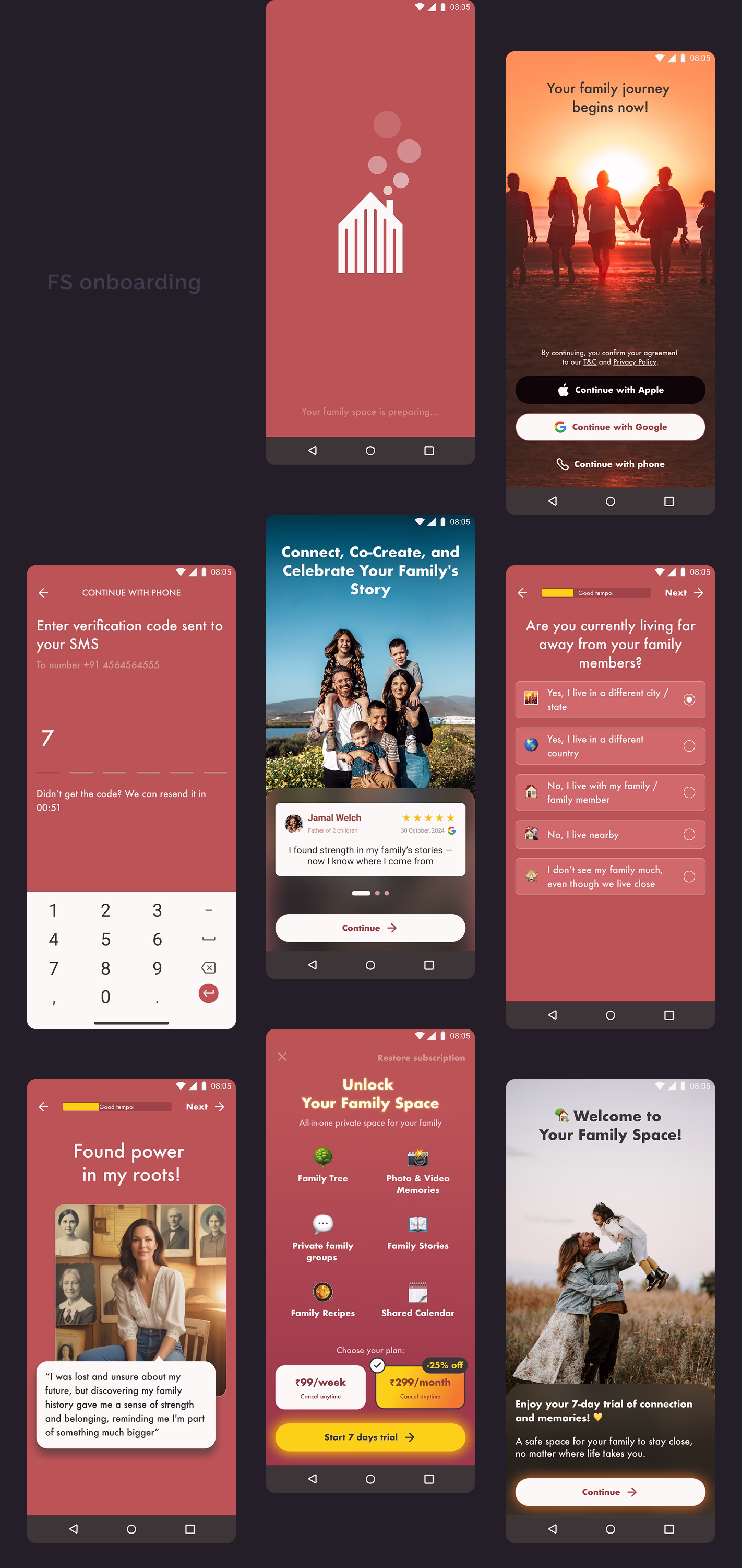
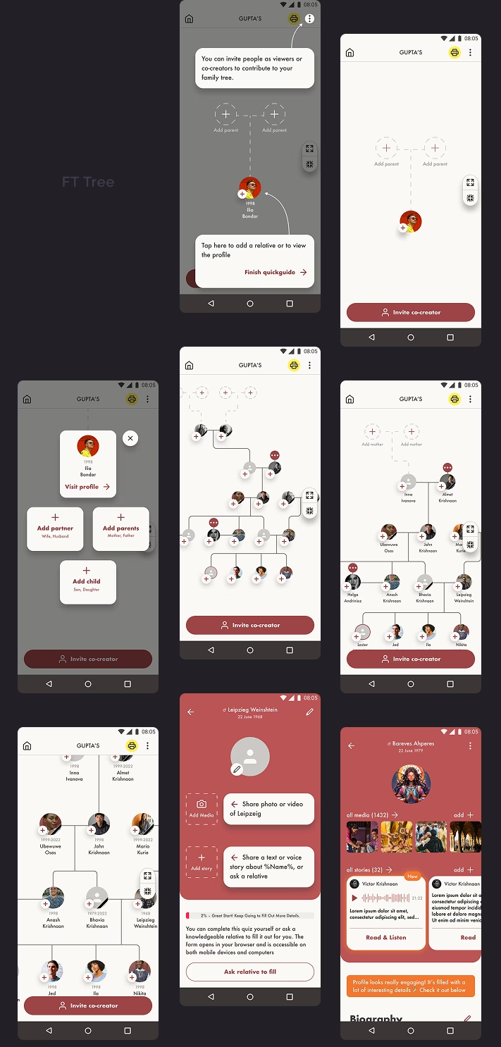
Challenges I had
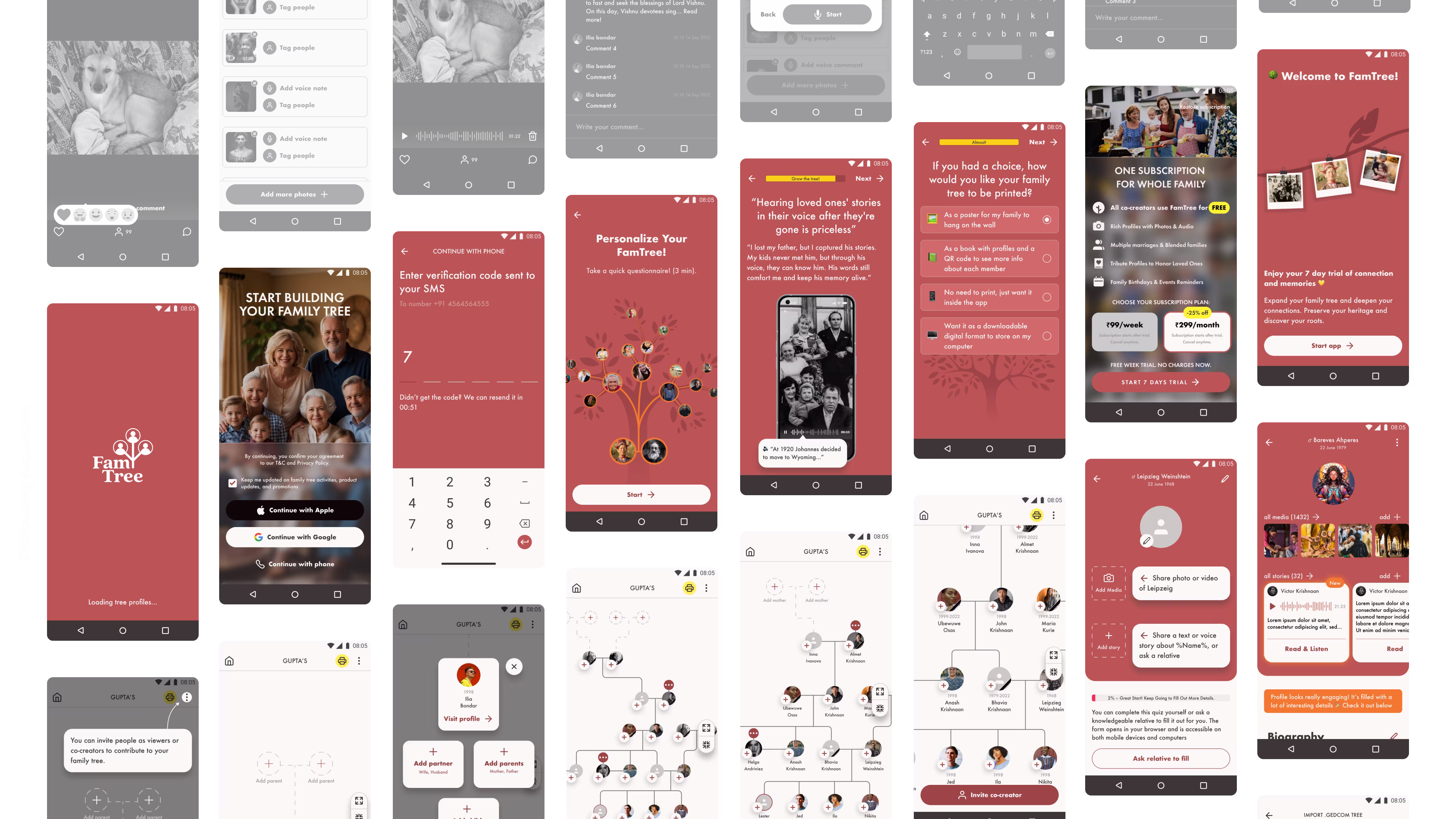
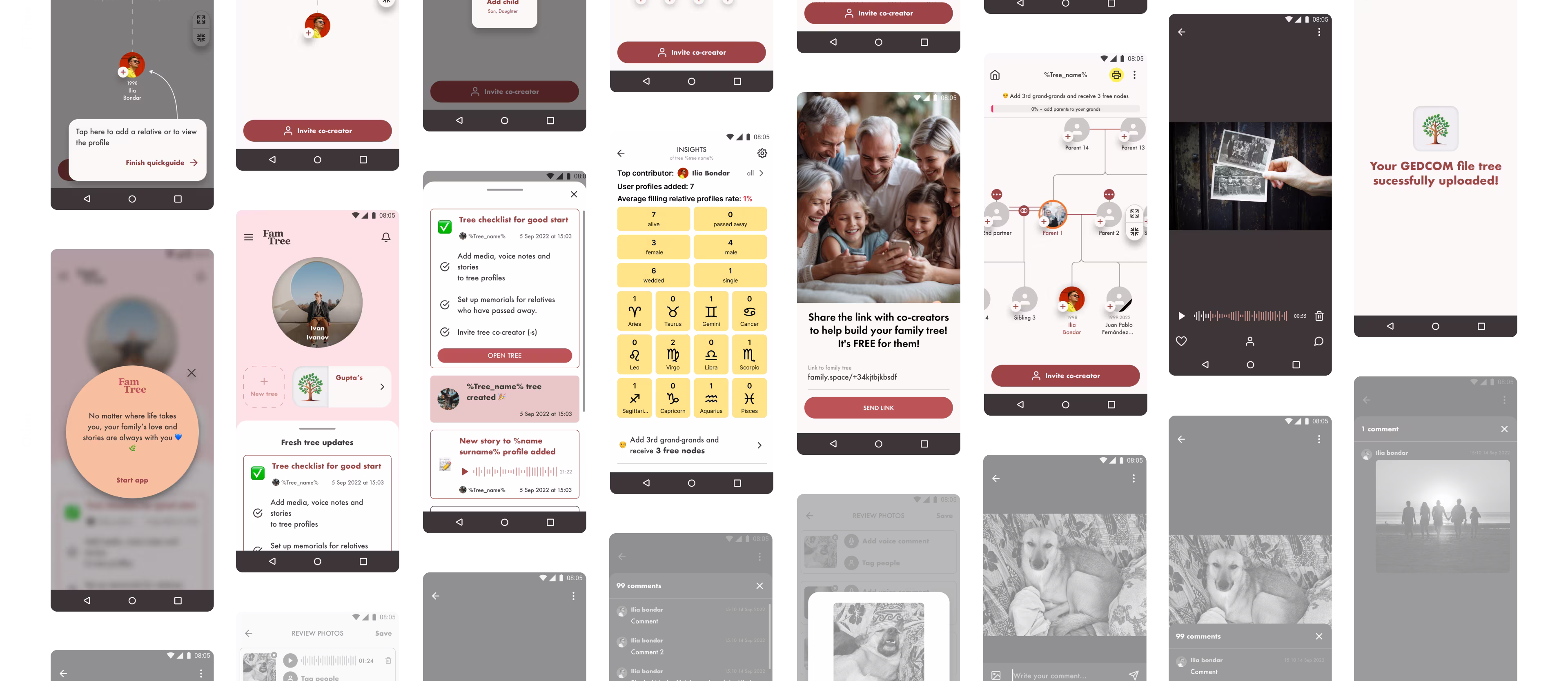
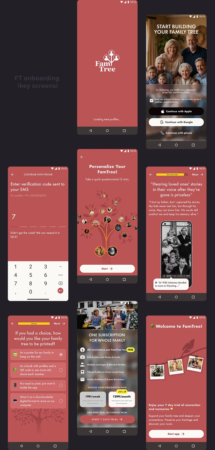
Research
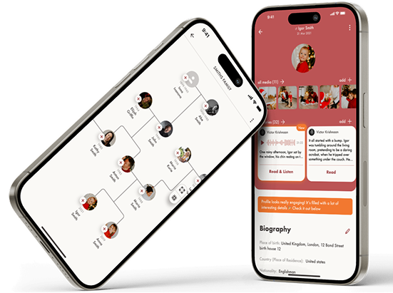
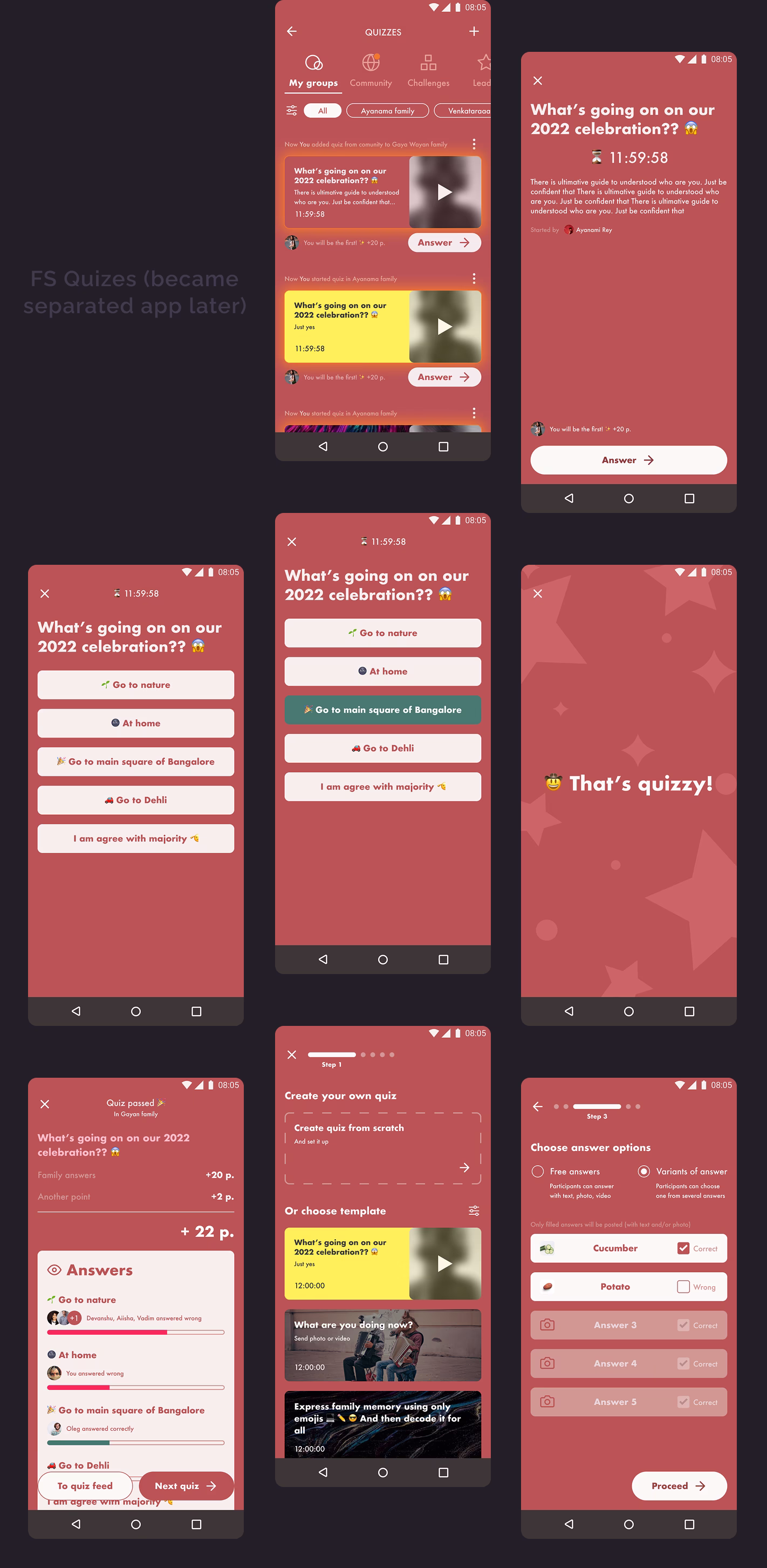
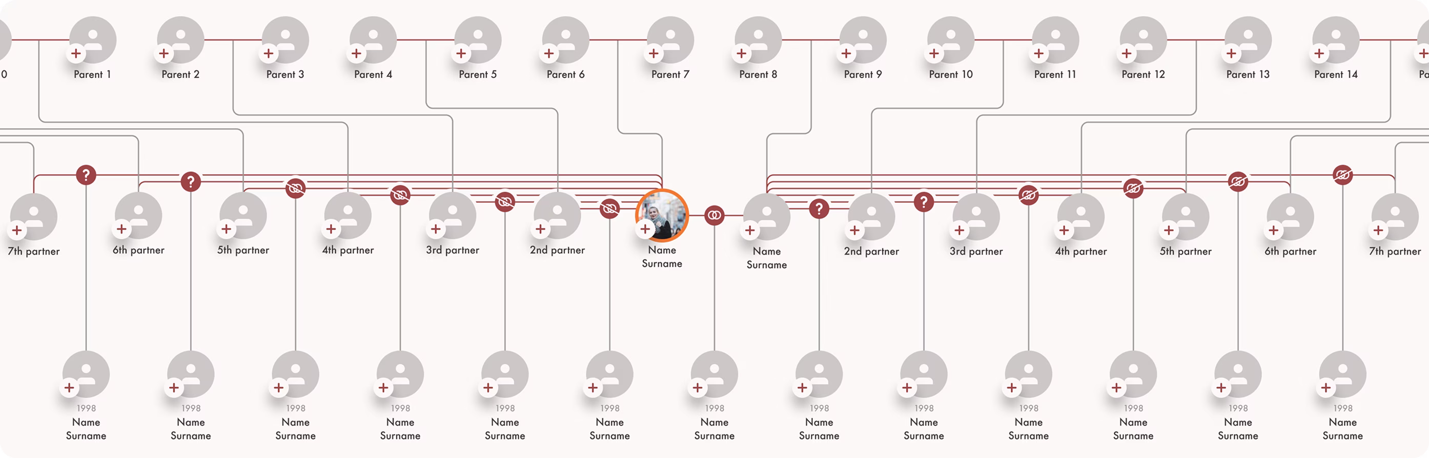
Dive deep into genealogy, business, and cultural differences across app audiences in India, the United States, LATAM, and the UK.
Drive metrics through design
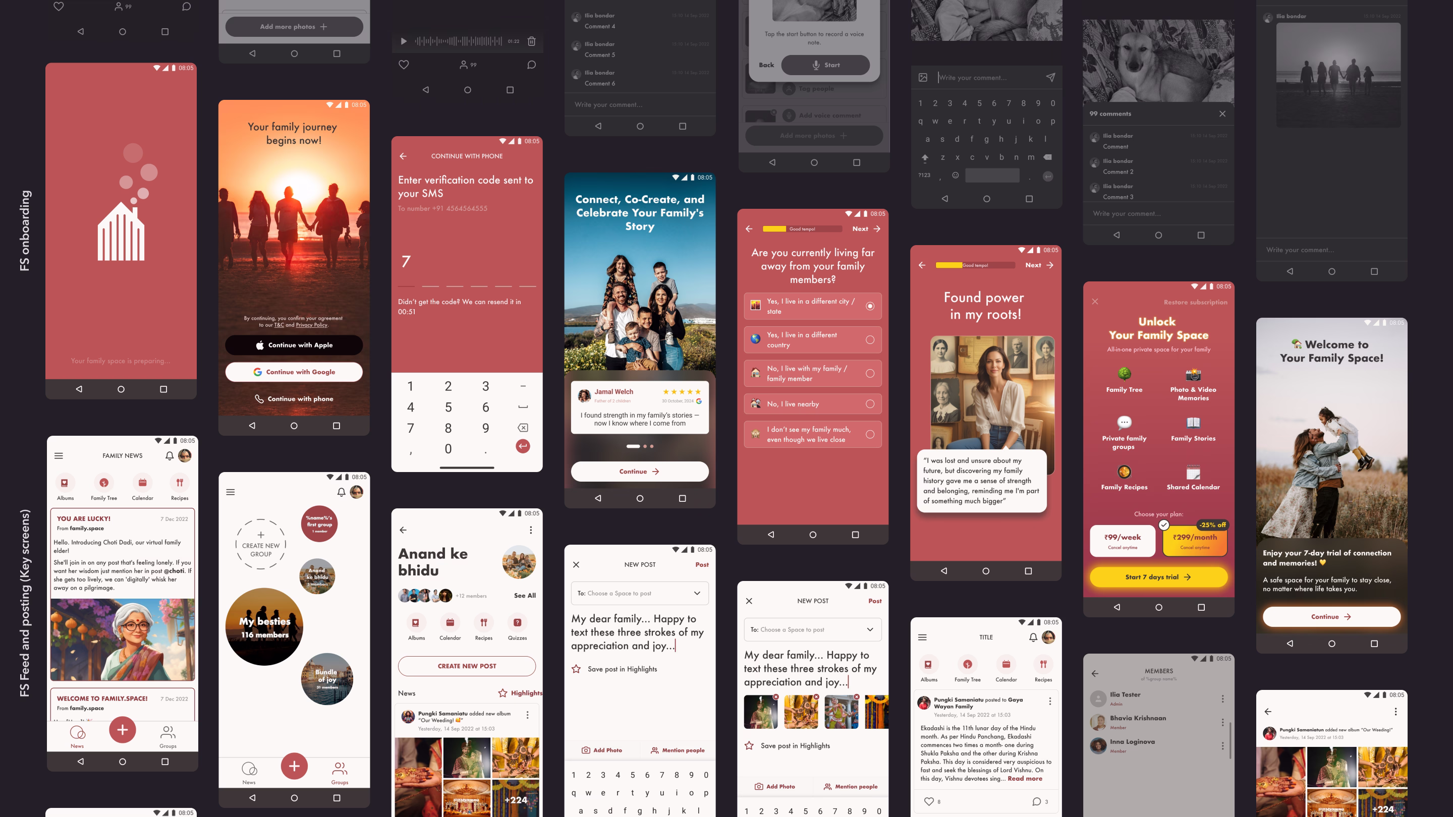
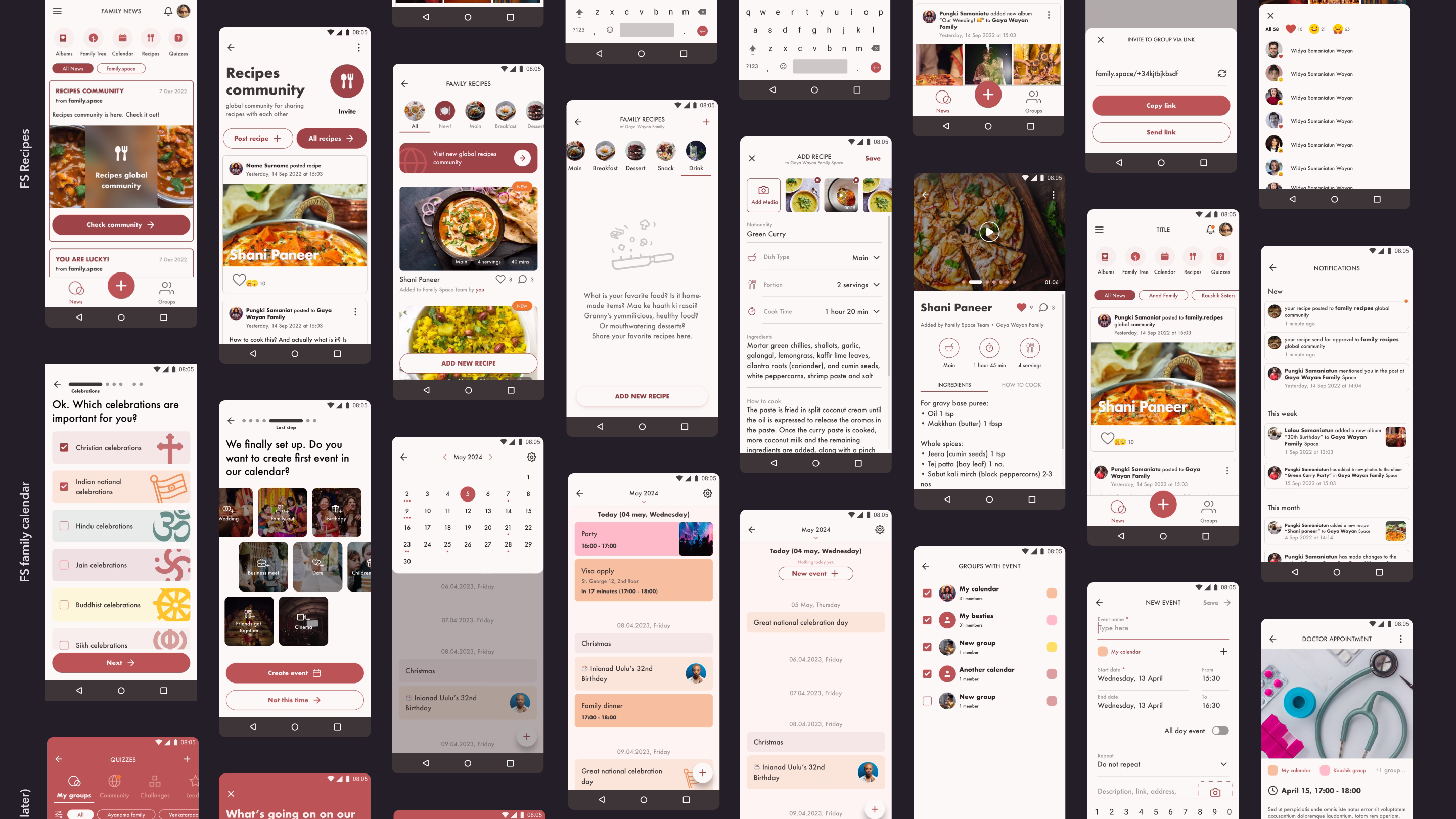
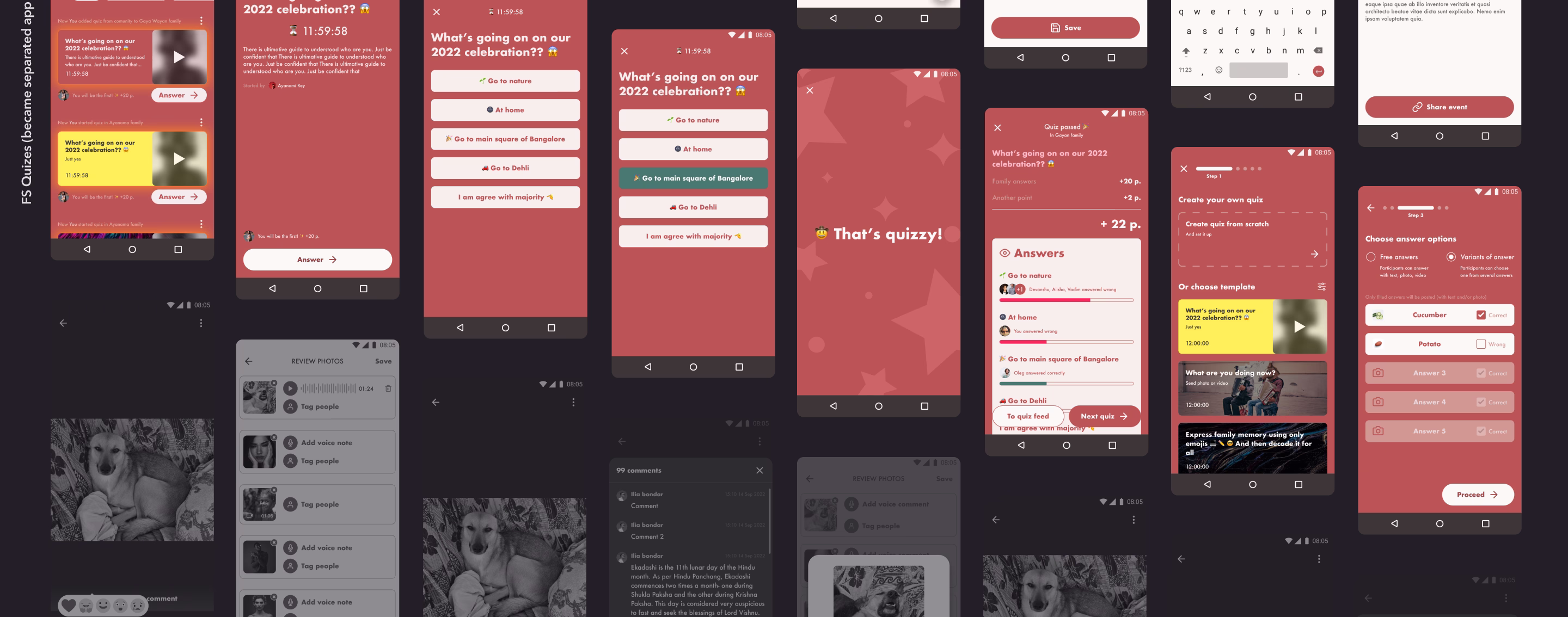
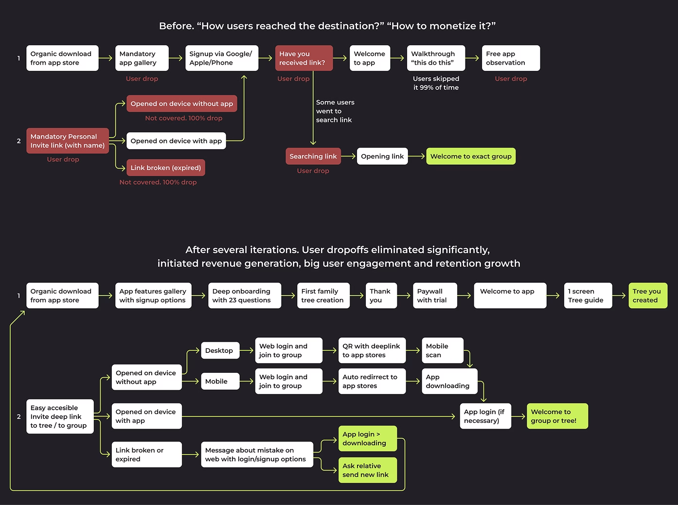
Improve key metrics: CR1 (Registration), CR2 (Subscription), and Retention. Eliminate user drop-offs during onboarding.
UX & Competitive advantage
Design killer features as a foundation designer.
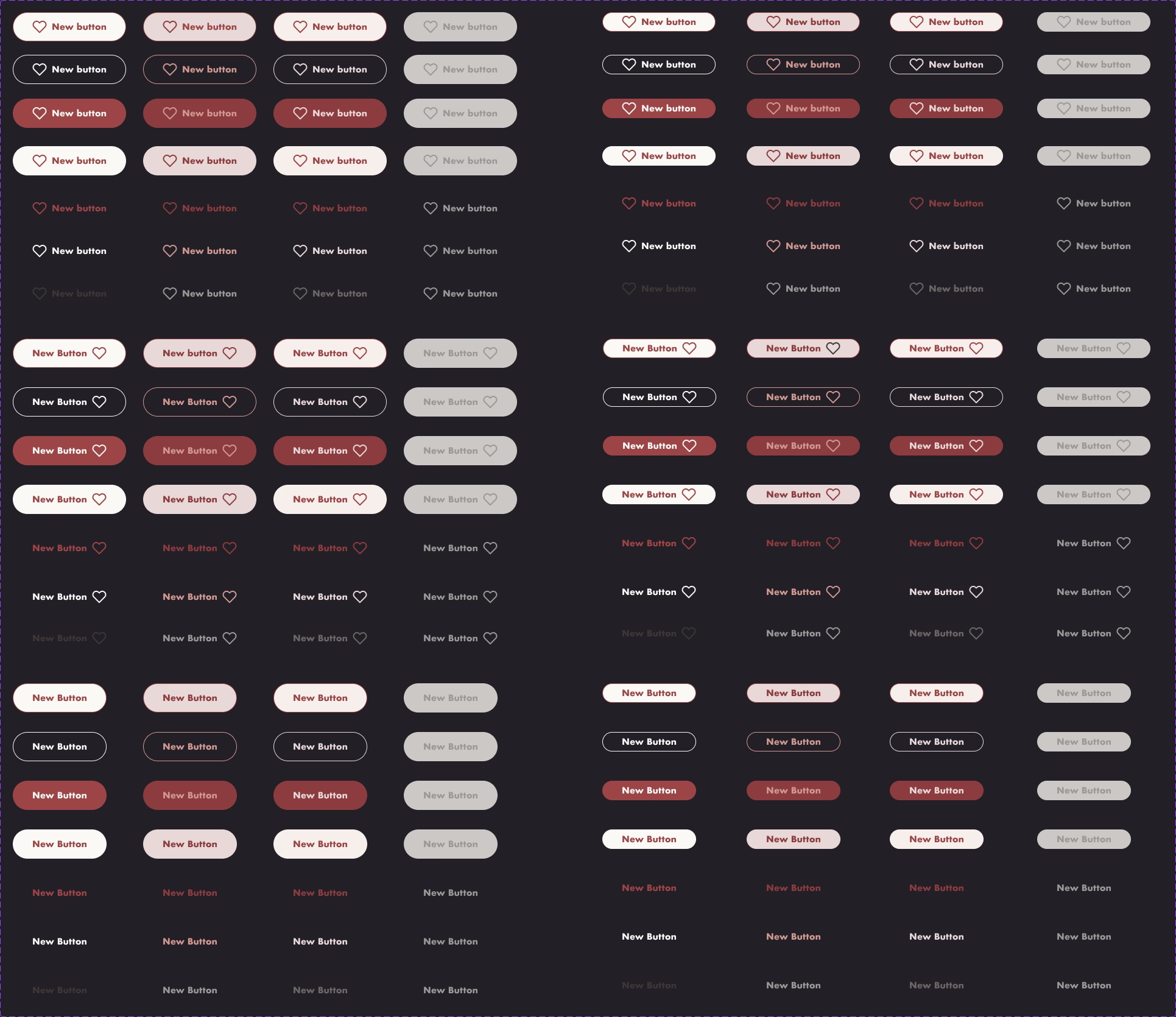
UI
To fix inconsistences across all apps.
Workflow & Design ownership
Set and optimize design-related processes in startup environment.
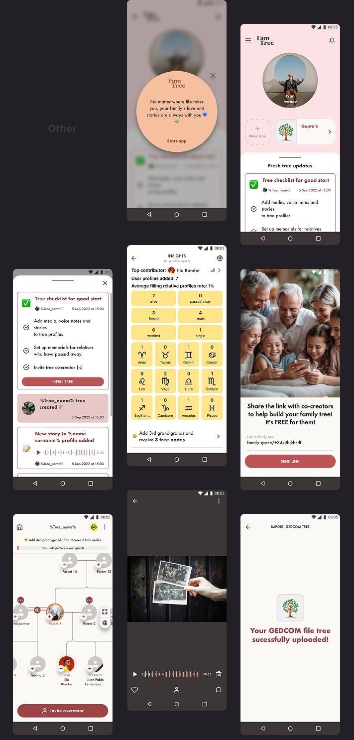
Things I did
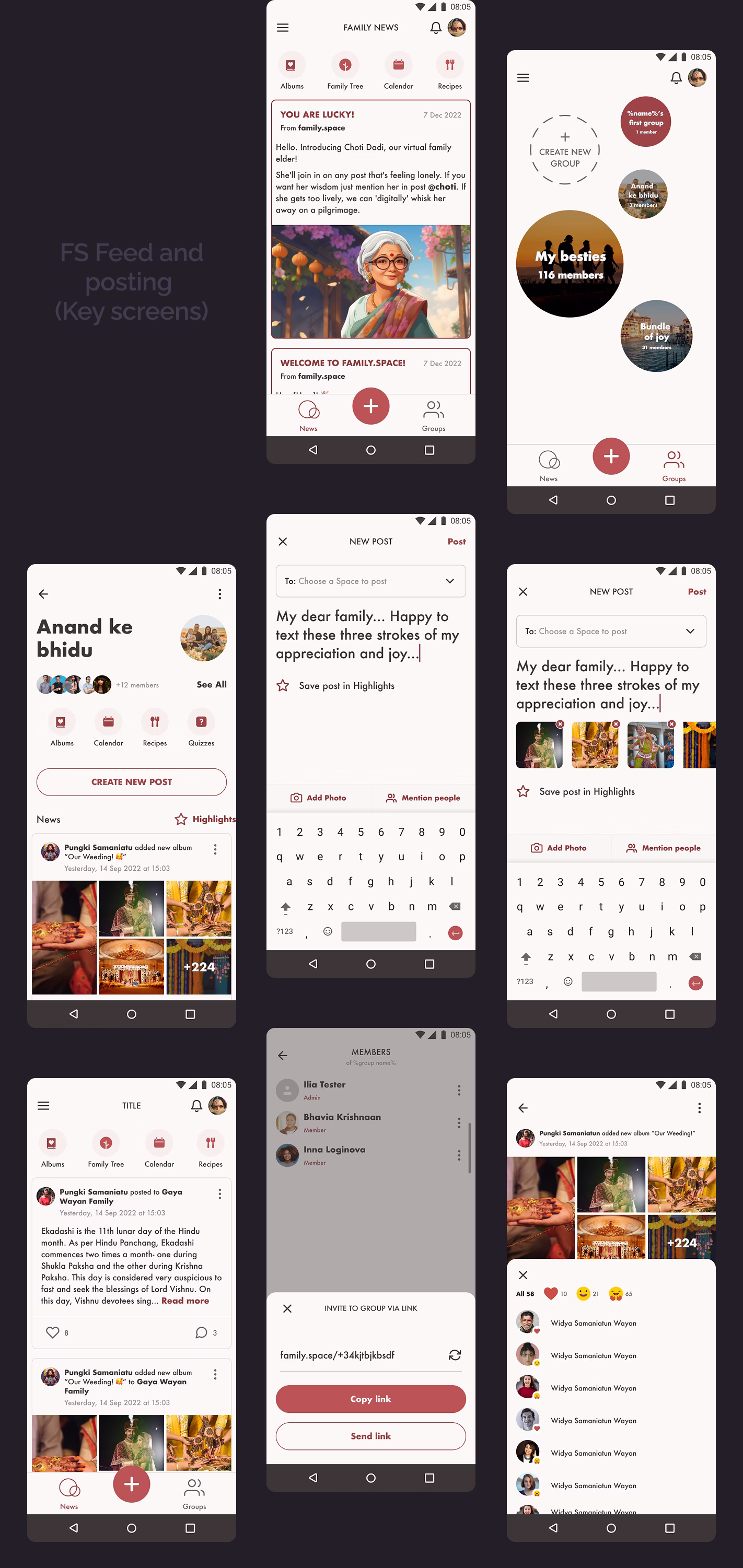
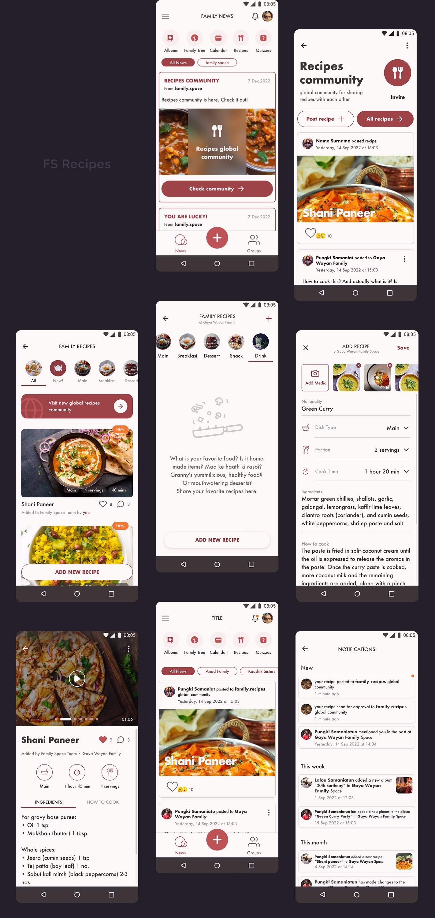
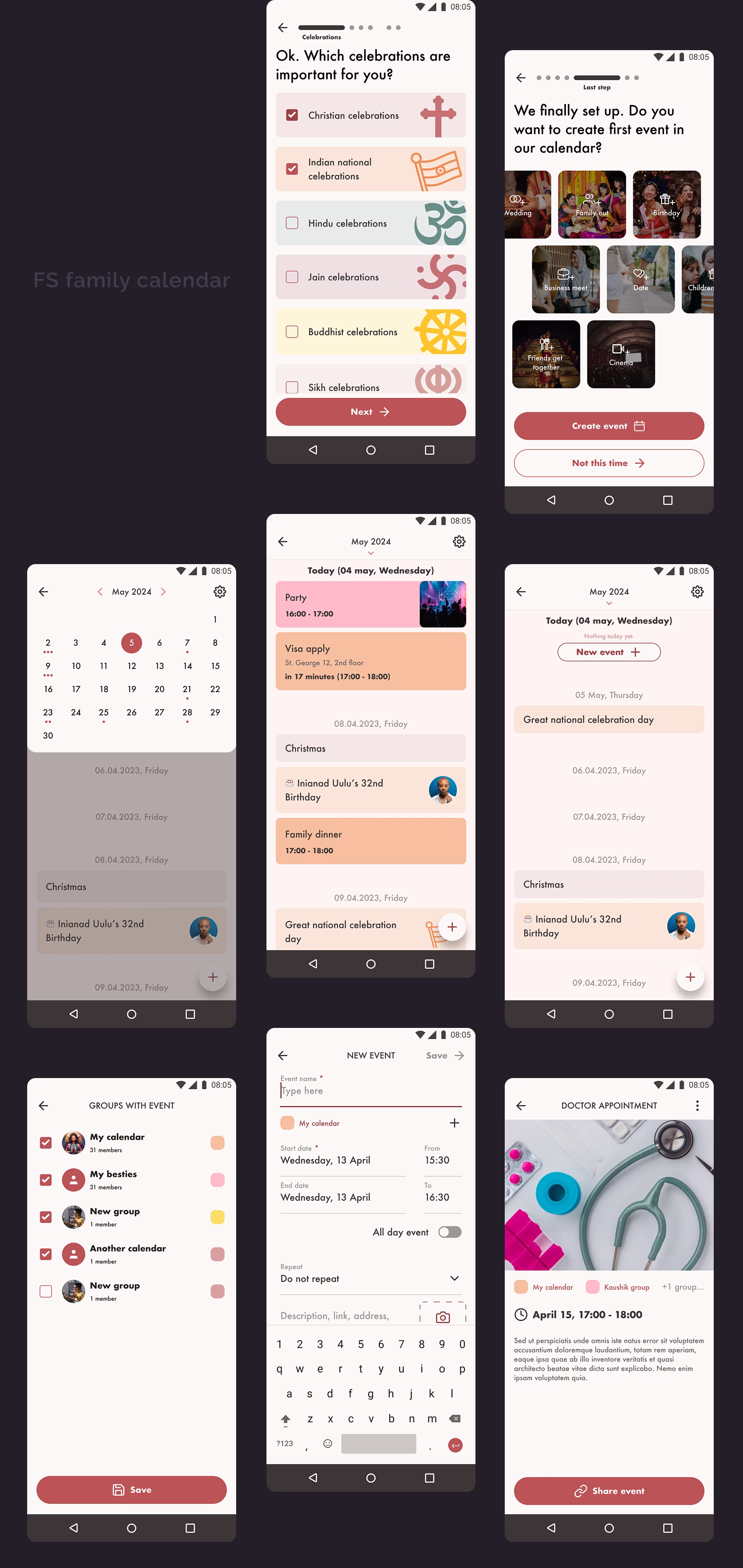
Research
Conducted an app audit. Researched competitors, market landscape, and the current user audience. Connected UX analysis system akin Hotjar.
Drive metrics through design
UX & Competitive advantage
UI
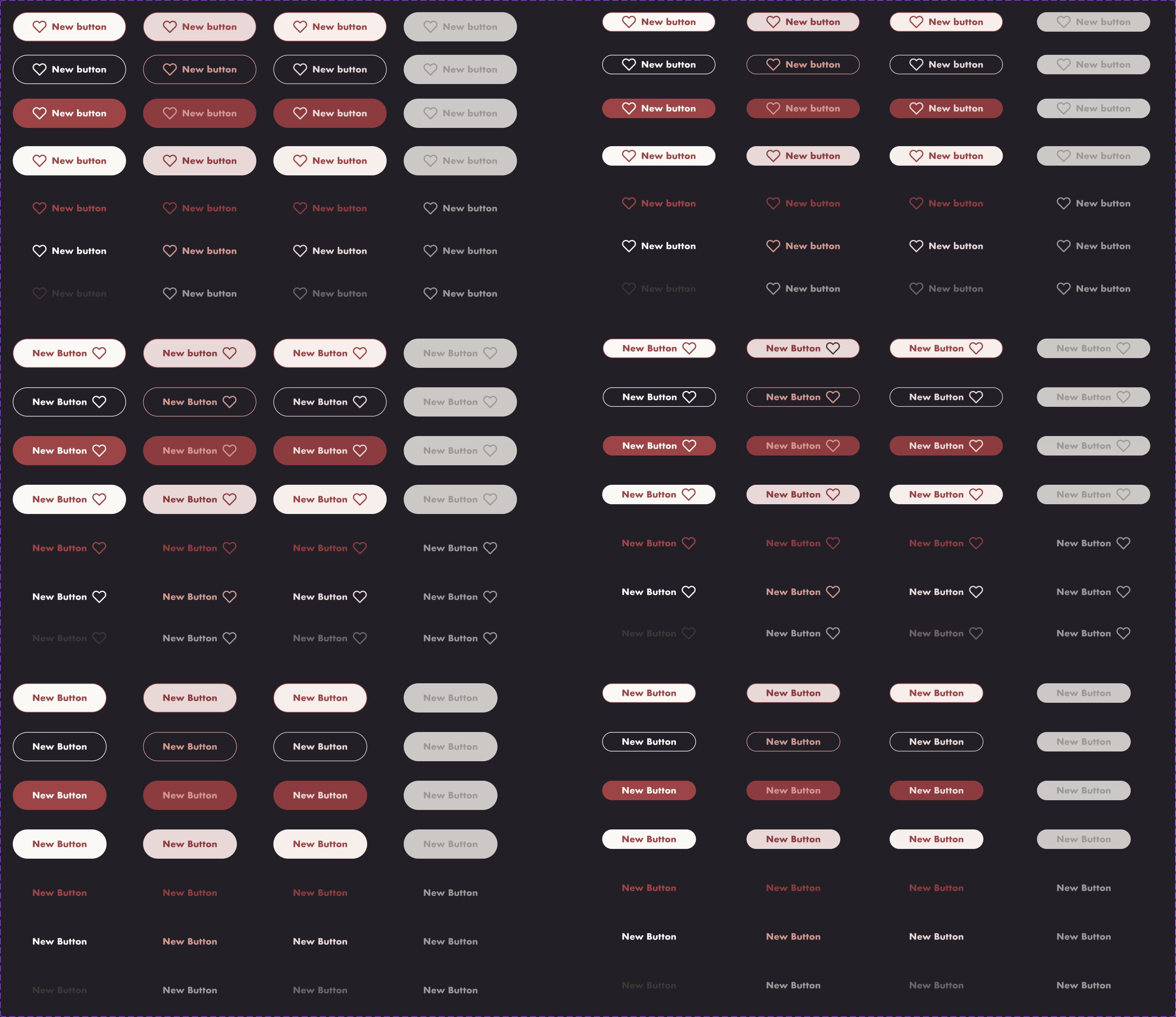
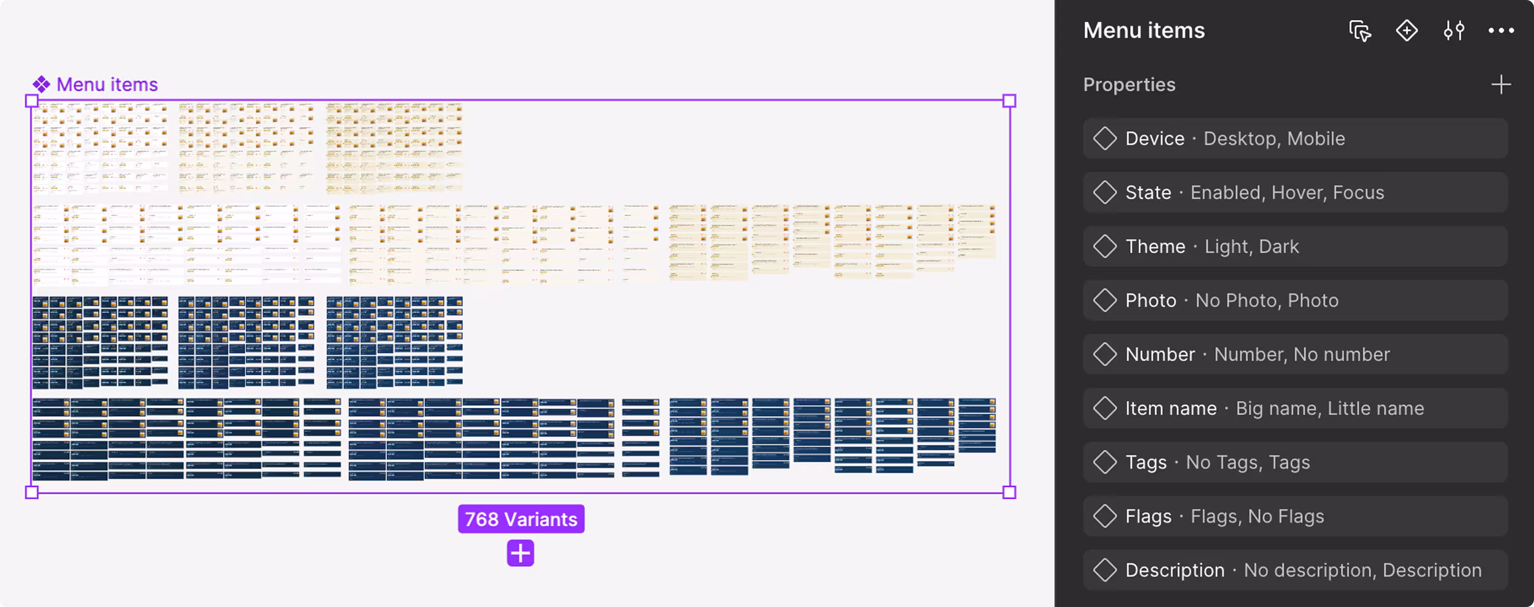
Developed and implemented a cross-platform design system, significantly accelerating every feature development speed.
Workflow & Design ownership

Key results
Delivered a private family social network and a scalable genealogy tree builder. Backed with a real-world family structures (killer feature). Drove CR1 and CR2 growth, 21%+ engagement uplift, improved retention, a 4.0 App Store rating, and 3x faster feature development.
If you’d like more details, explore the full case studies
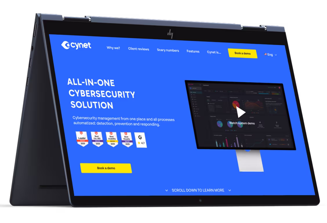
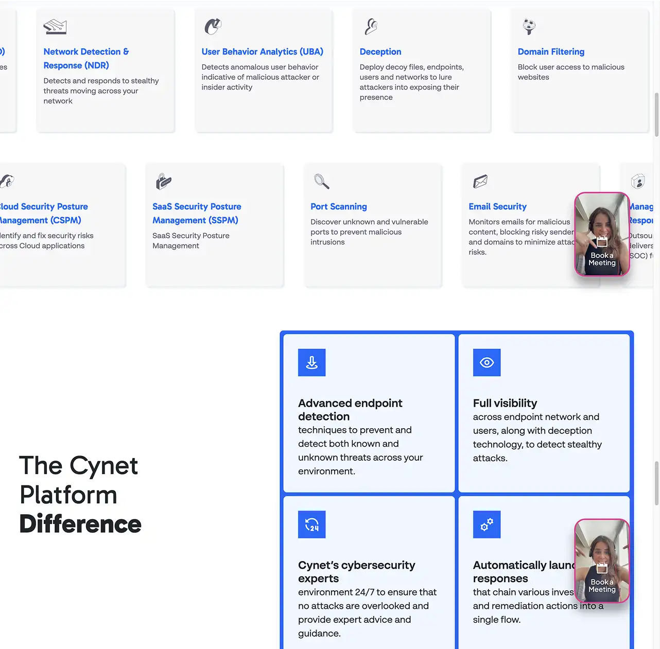
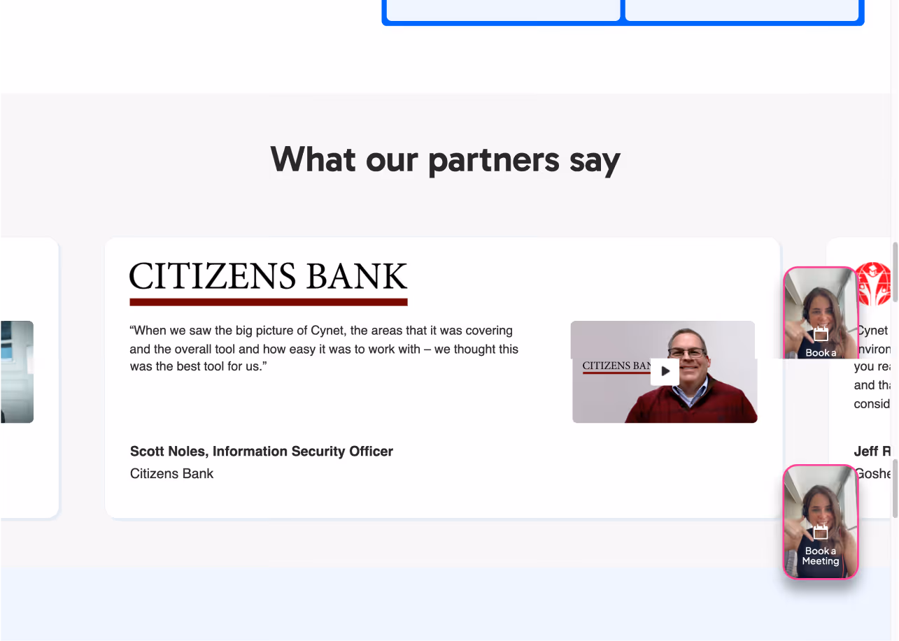
Rapid redesign of a cybersecurity corporate website to build trust, improve usability, and clearly communicate value to safety managers. Delivered in 18 hours.
Detailed case studies:
Challenges I had
Research & UX
UI & Brand
Align visual language changes with a serious cybersecurity tone and brand identity
Speed
Deliver high-quality and development-ready results under extreme time constraints (18 hours)
Things I did
Research & UX
UI & Brand
Speed
Used AI-assisted tools to speed up research and concept validation under very tight deadlines
.webp)
.webp)
.webp)
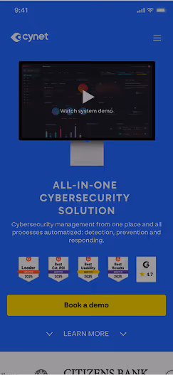
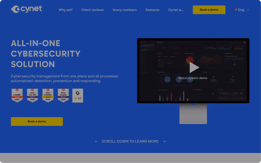
Key results
Completed the redesign in under 18 hours - from brief to a development-ready prototype. The updated structure improved content clarity, visual hierarchy, and brand alignment compared to the initial concept.
If you’d like more details, explore the full case studies
cynet website redesign
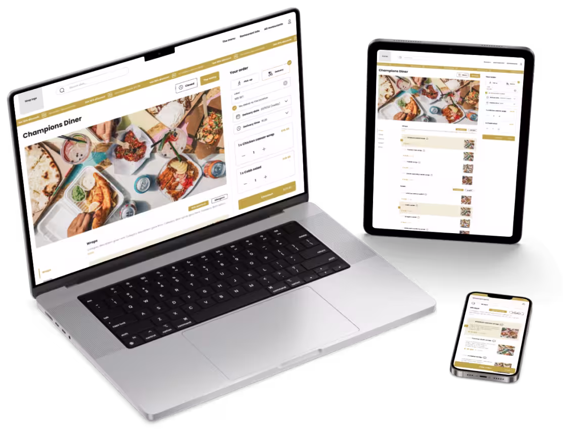
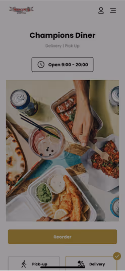
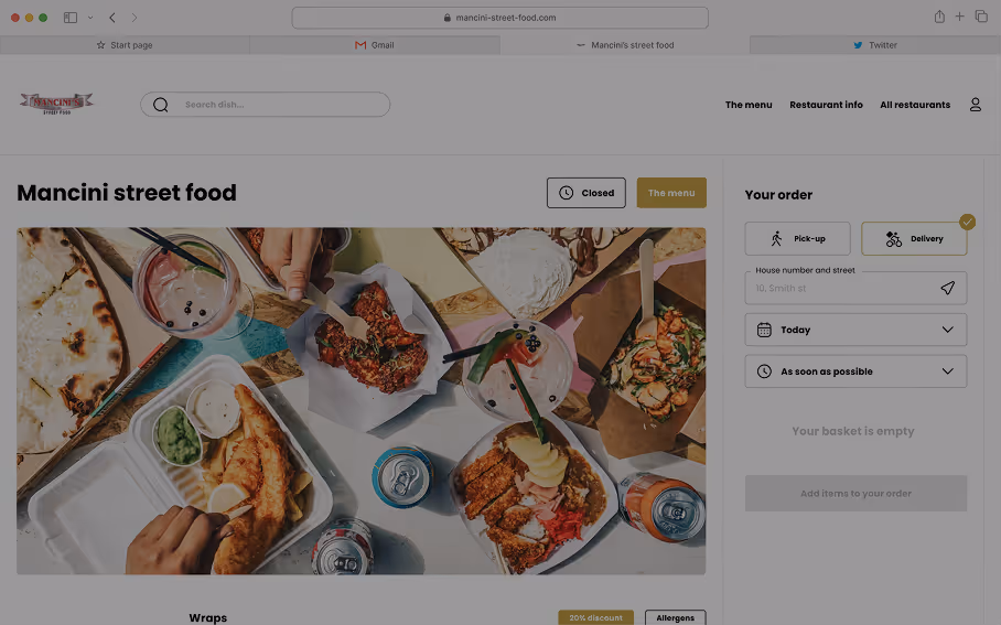
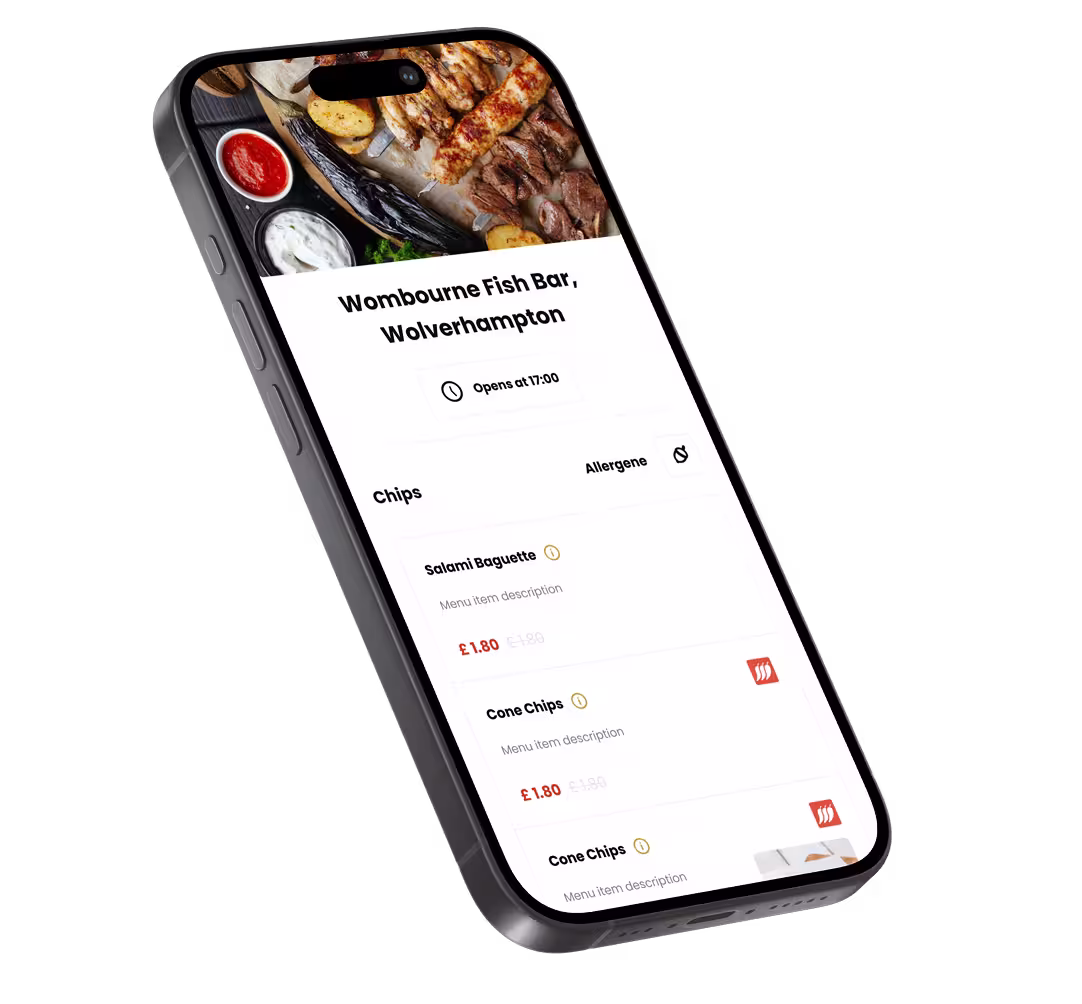
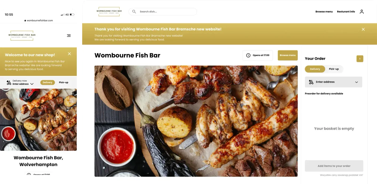
A multi-platform app enabling European restaurants to manage online food ordering - menus, table ordering, delivery, and checkout. Designed to be fault-tolerant and high-load. The system is serving millions of users daily across Germany, Denmark, Austria, Ireland, Sweden and United Kingdom.
Detailed case studies:
Challenges I had
Research
Drive metrics through design
UX
Design end-to-end, localized, and platform-optimized features aligned with product vision and local regulations
UI
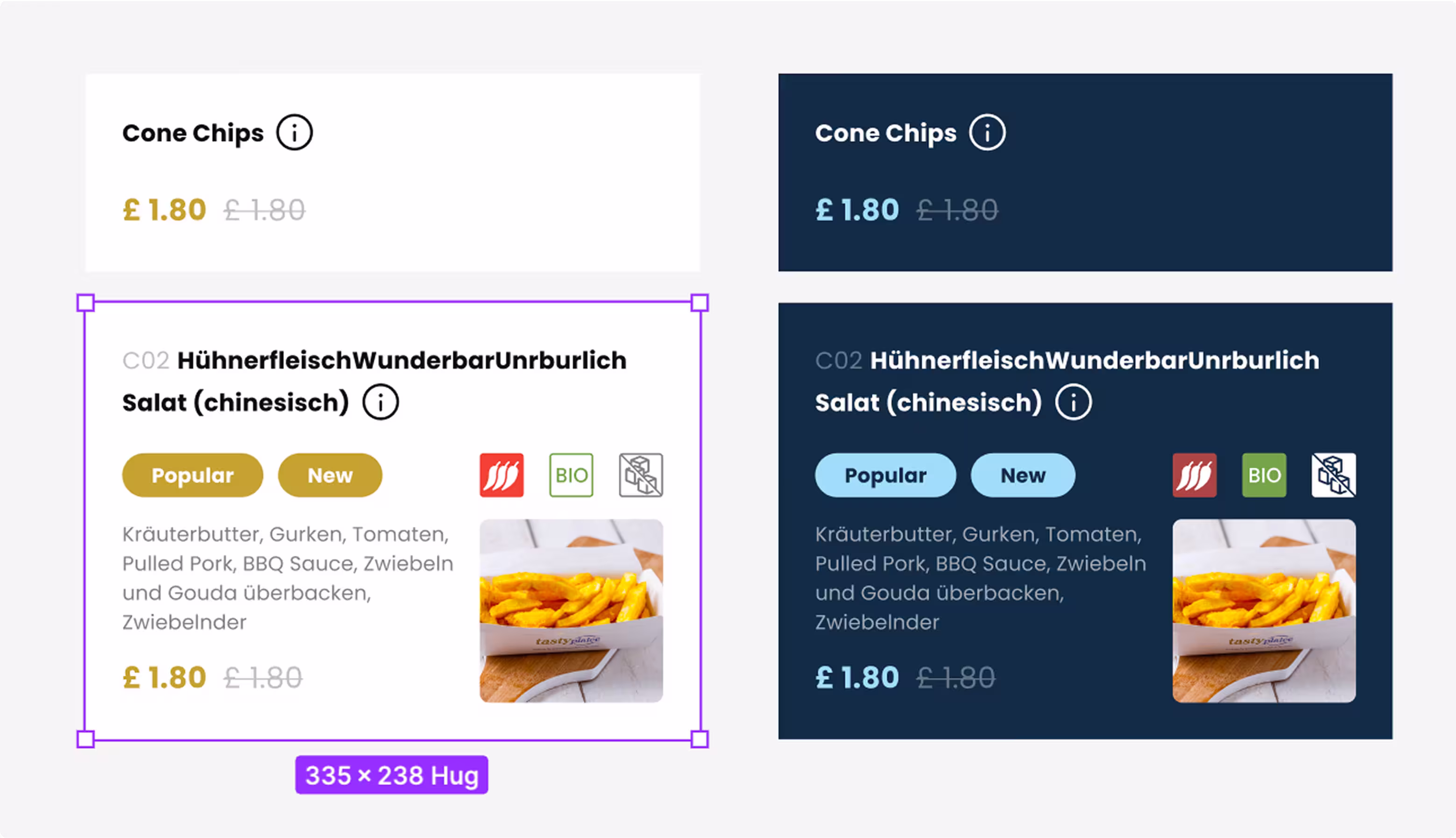
Fix inconsistencies across Web, iOS, and Android by building a shared design system under tight time and resource constraints
Workflow & Design ownership
Review designs and prototypes to ensure alignment with product specifications and brand guidelines. Facilitate features brainstorming sessions with colleagues.
Things I did
Research
Drive metrics through design
UX
Delivered end-to-end, localized, and platform-optimized designs for new features and improvements across EU markets, supporting a 10M+ MAU product
UI
Built a scalable cross-platform design system, accelerating feature delivery by 3x and reducing inconsistencies across Web, iOS, and Android
Workflow & Design ownership
Reported results to Product, VP, and CTO; supervised feature implementation and conducted cross-reviews for other design teams


Key results
The delivered improvements increased daily orders by 5,000+, added over €10K in daily revenue, and improved retention and average order value across EU markets. A scalable cross-platform design system reduced inconsistencies and accelerated feature delivery by 3x for a 10M+ MAU product.
If you’d like more details, explore the full case studies

Webshop for EU restaurants
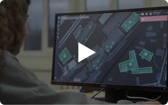
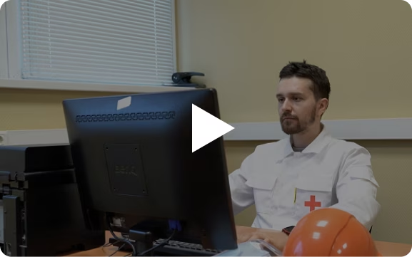
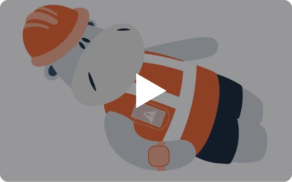
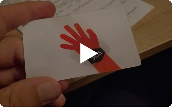
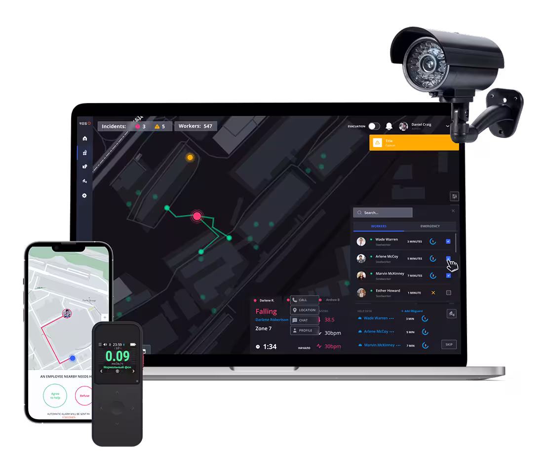
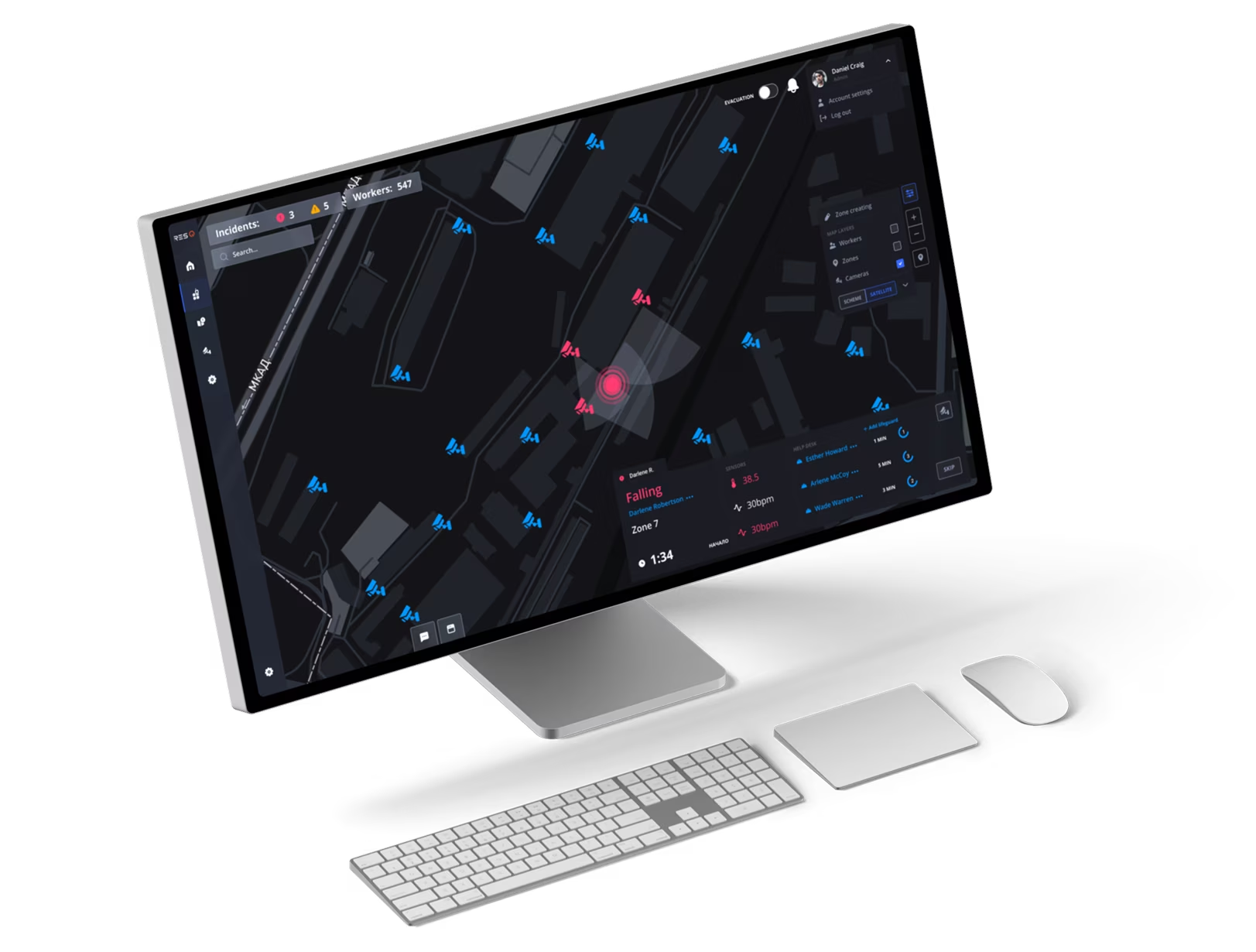
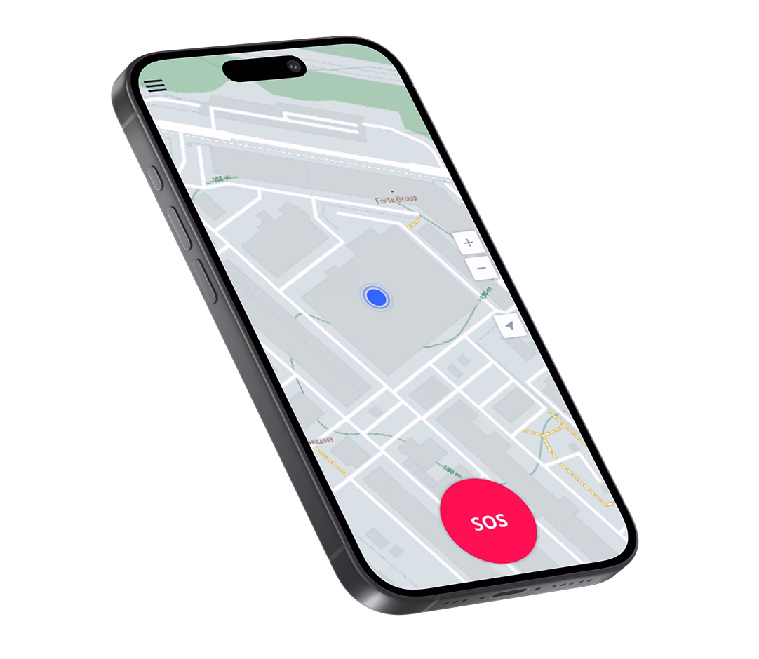
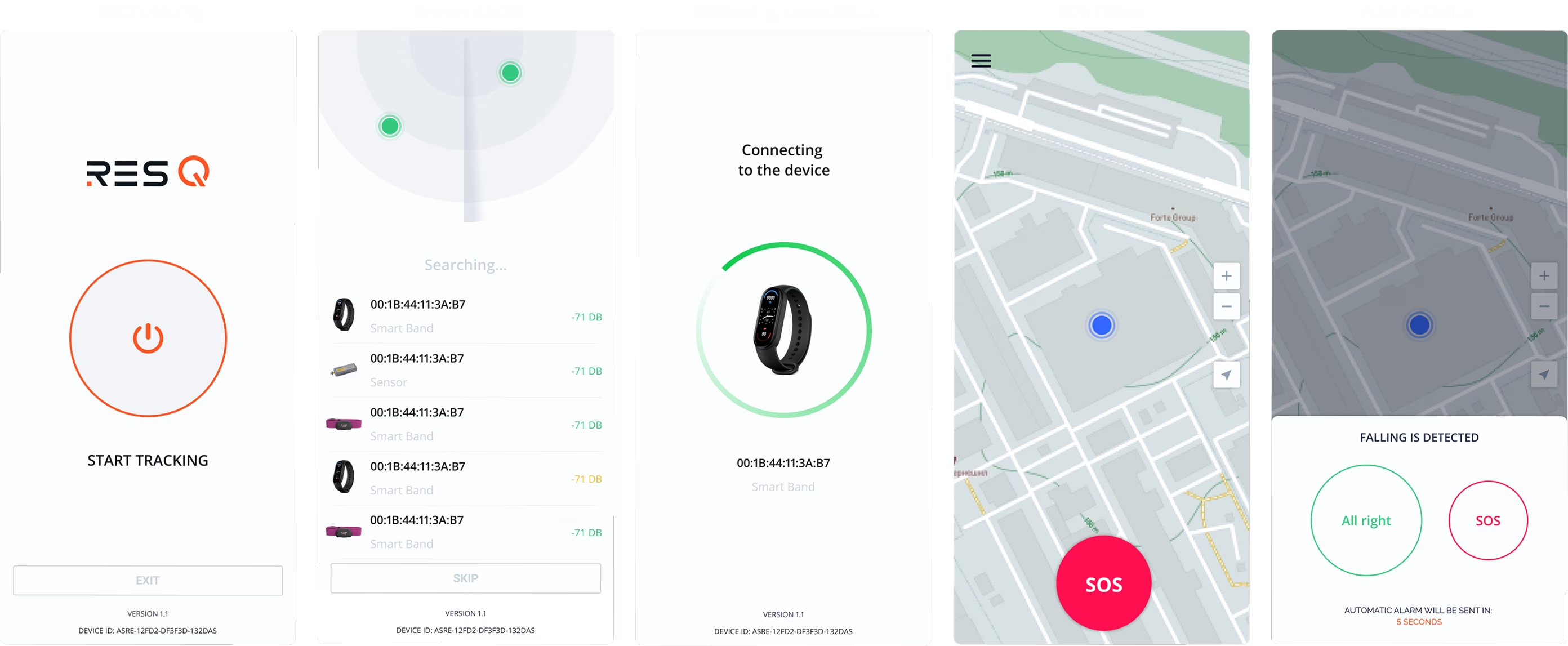
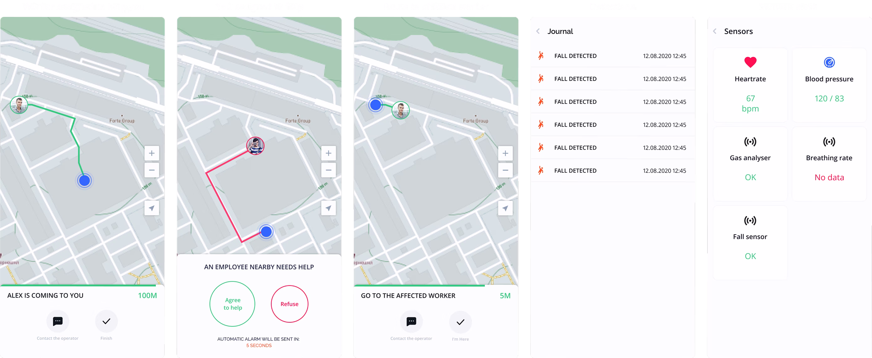
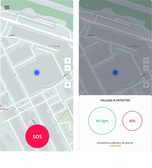
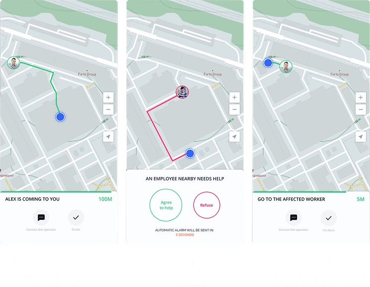
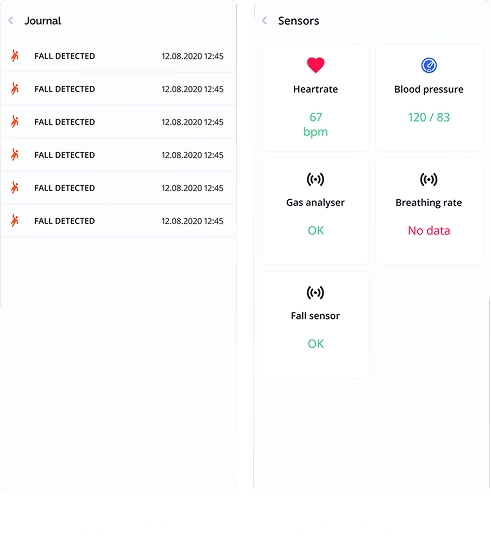
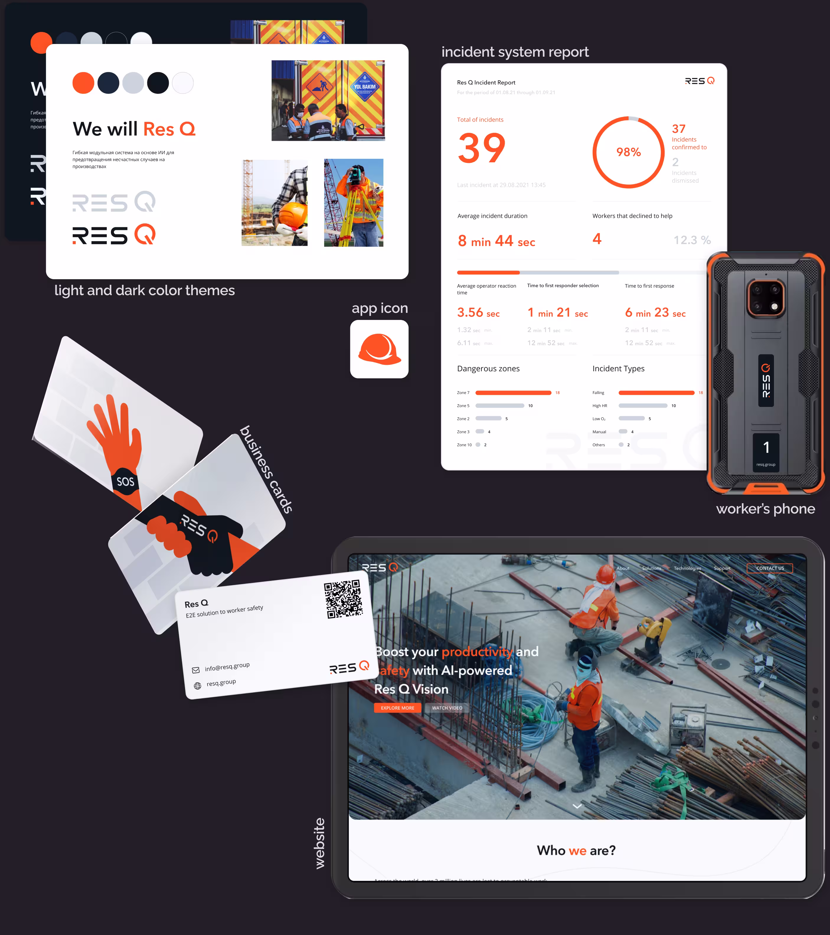
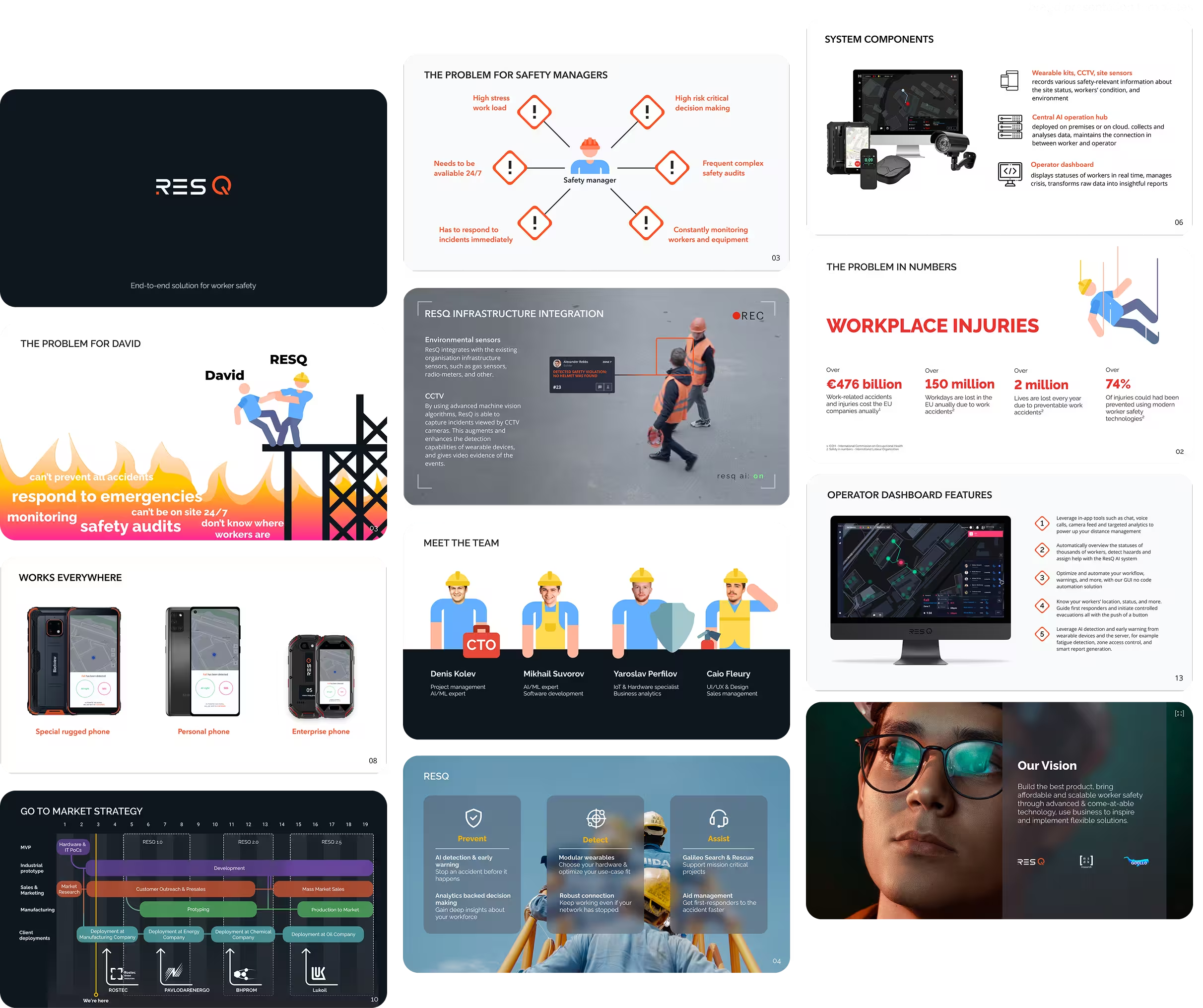
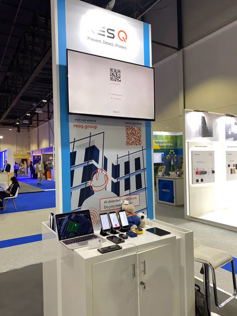
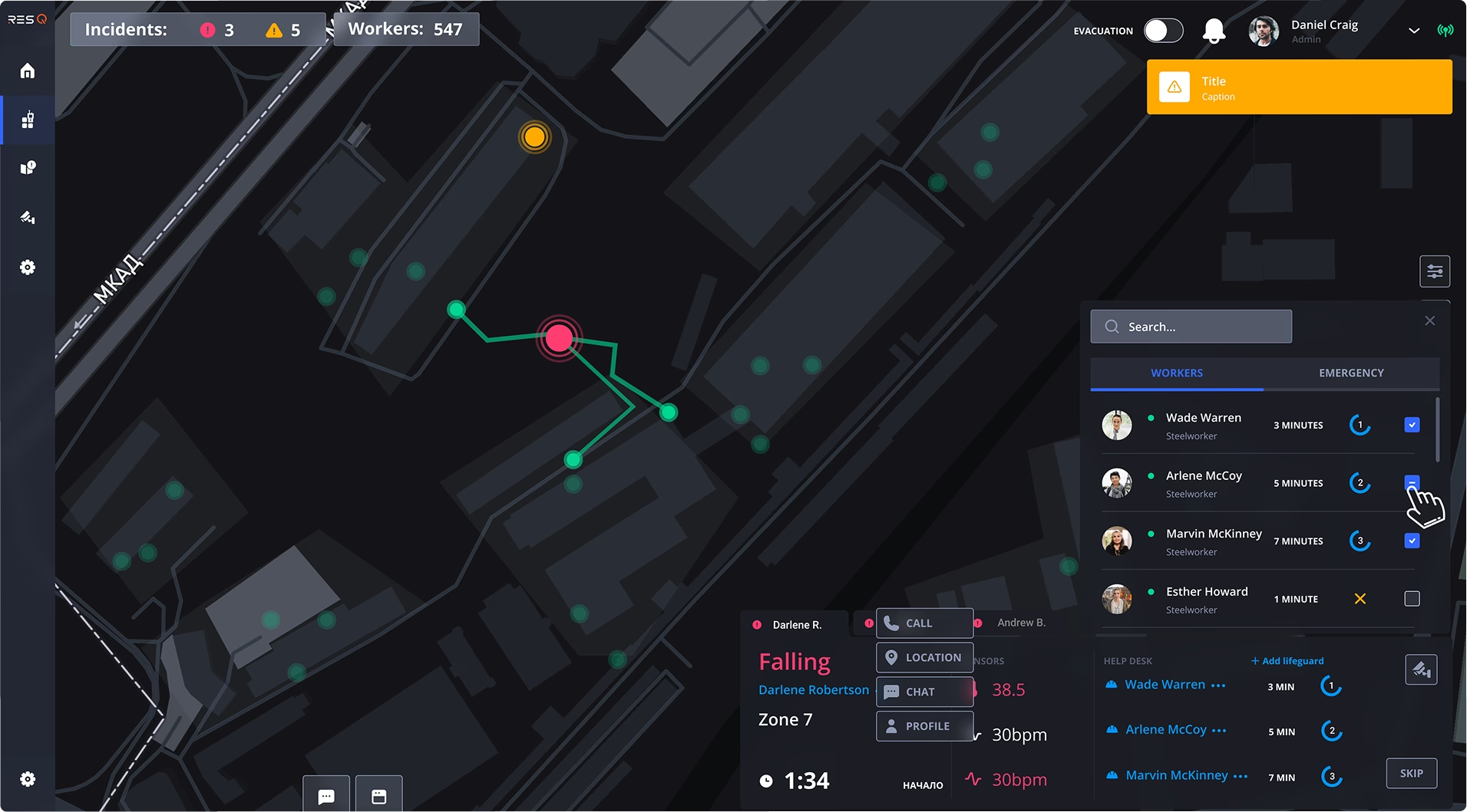
AI safety management platform designed for manufacturers and high-risk businesses. The system collects and analyzes real-time data from wearable and environmental sensors to monitor safety conditions, detect incidents, and provide immediate realtime response.
Detailed case studies:
Challenges I had
Research
Conduct deep business, technical, legal and marketing research in collaboration with CEO
Design
Workflow & Design ownership
Things I did
Research
Conducted deep research into IoT architecture, sensors, P2P technologies, EU safety regulations, competitor solutions, and technical constraints to inform product and UX decisions. Facilitated brainstorming sessions with CEO and lead developers
Design
Workflow & Design ownership
.avif)
Key results
In 4 months, delivered the full ResQ product ecosystem: from core UX and mobile/desktop apps to brand identity, website, and exhibition assets. Built and led the design team, ensured end-to-end delivery, and successfully pitched the product to 100+ international clients at the BIG5 exhibition in Dubai.
If you’d like more details, explore the full case studies
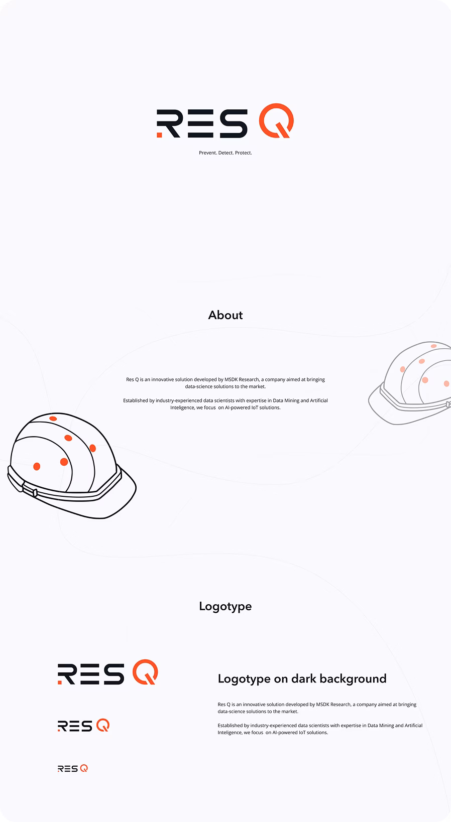
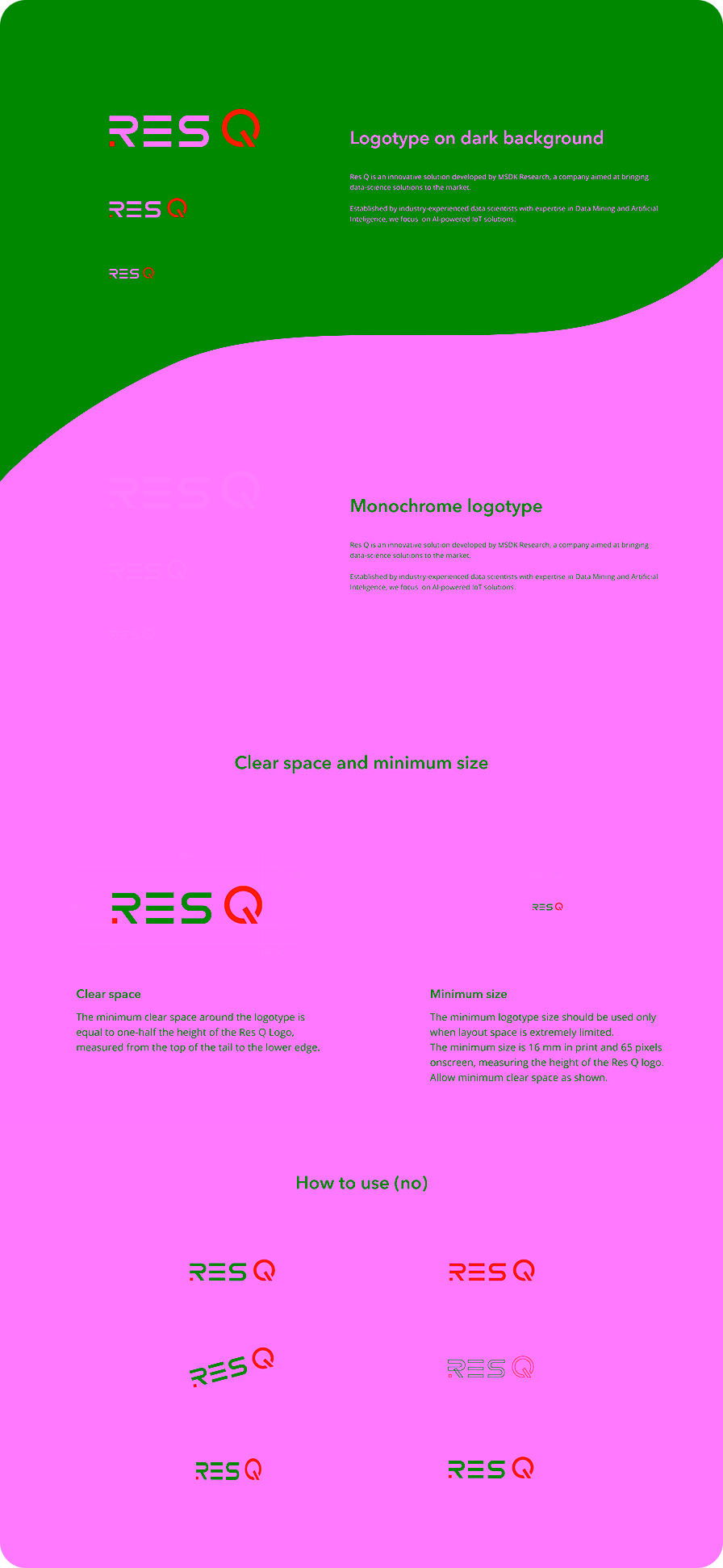
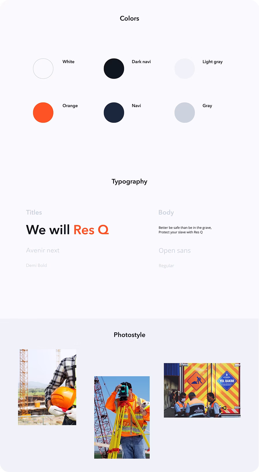
Resq
B2B Desktop (Windows) Point Of Sale system. Food-tech and Fin-tech. Markets: EU.
B2B CRM system for weddings organisation. Market: India.
B2B design leadership for desktop training system for racers. Market: Russia.
B2B Mobile checking app. Fintech, Food tech. Markets: EU
B2C art direction for an illustration pack for a Russian IT school.
B2G High-load and fault-tolerant bureaucracy demographic system.
B2C branding for student IT educational championship in Russia.
B2C website art direction for IT department website in Moscow Bauman State University
All projects
If you’d like more details, explore the full case studies


.avif)
.avif)
.avif)
.avif)