logo
bondar.design
so, we are loading

bondar.design/order_manager

Order Manager
b2b
Android
UX
UI
foodtech
branding
animation
Order Manager is a mobile application for payment device used by restaurant staff to handle core daily operations - including order tracking, receipt printing, and opening/closing the restaurant for delivery and pickup. The app is designed to be fast, reliable, and brand-aligned for use in high-pressure environments.
Design tasks which I had and completed:
Did rebranding of the mobile app, updating the visual identity to align with the overall product ecosystem. Migration from Appsmart style to OrderYOYO one.
Created a branded loading animation to elevate first impressions and unify the experience with the parent brand
Designed a new UX/UI flow for managing opening times, allowing restaurant staff to set custom hours for delivery and pickup with ease
Optimized usability for frontline users in fast-paced settings, focusing on clarity, tap targets, and minimal friction
Order Manager
b2b
Android
UX
Ui
foodtech
branding
branding
Ilya Bondar, app, mobile, app, hunger.de, hunger, hunger, foodtech, food, restaurantsIlya Bondar, app, mobile, app, hunger.de, hunger, hunger, foodtech, food, restaurants
Project note from Ilya
This project was a bit unusual for me - it started not with core UX flows, but with rebranding tasks and interface fixes, followed by the design of a custom splash screen animation to reflect the updated identity. From there, I transitioned into deeper product work, including UX and UI for new functional areas like restaurant opening time management

Rebranding + previous color system fixes

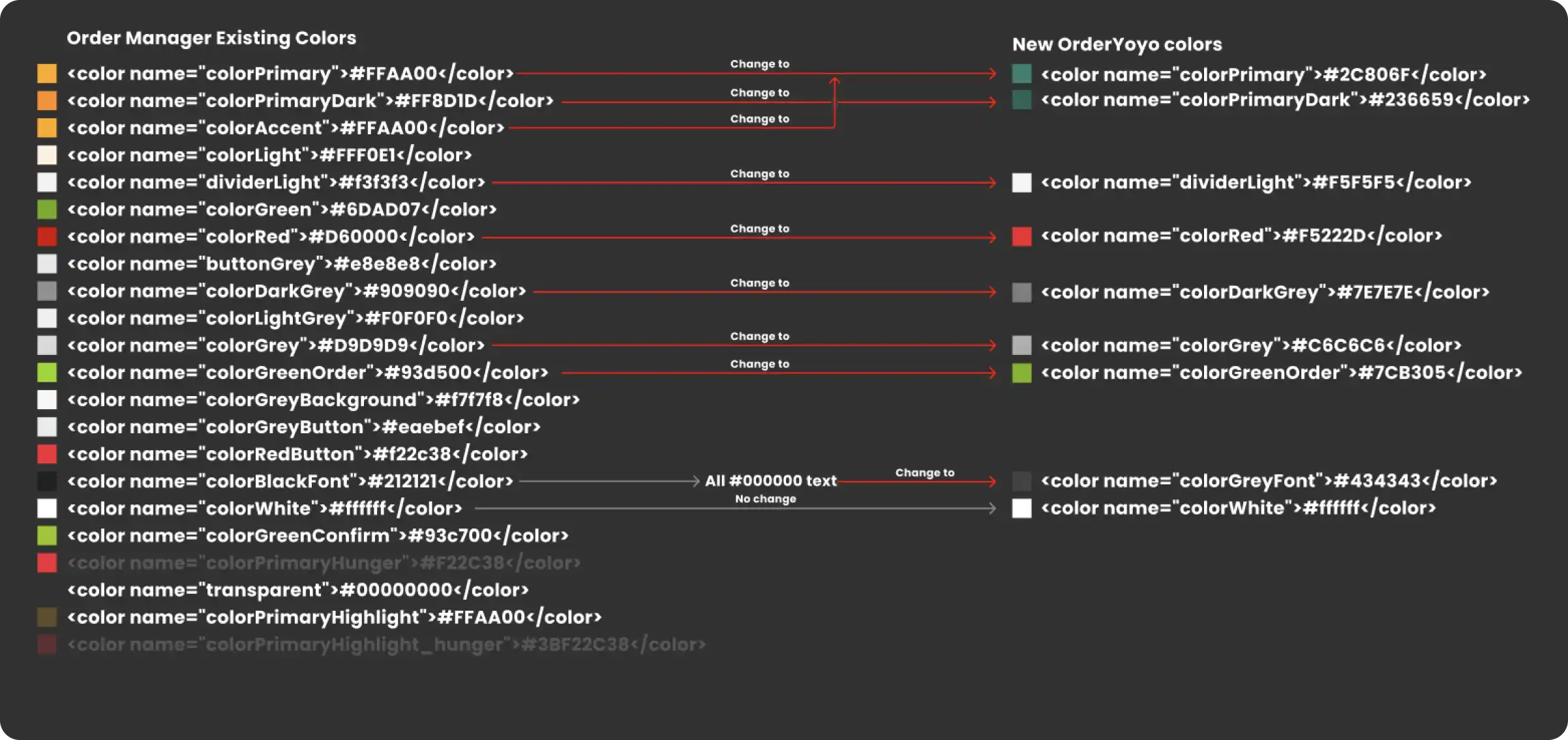
One of the first challenges on this project was to manage the transition between two overlapping brand books — the existing legacy identity and a newer, evolving visual direction. I conducted a detailed audit of the current color usage across the app, identified inconsistencies and implementation errors, and mapped old color tokens to their correct counterparts in the new system.
This task required both design sensitivity and systematic thinking, as I worked to preserve visual continuity while aligning the UI with the updated brand. The result was a cleaner, more unified interface and a stronger foundation for future product updates.
Ilya Bondar, POS, app, app, mobile, foodtech, design design, product design, UX, UI
This task required both design sensitivity and systematic thinking, as I worked to preserve visual continuity while aligning the UI with the updated brand. The result was a cleaner, more unified interface and a stronger foundation for future product updates.

New brandy splash animation

Play Video
Pause Video
Volume
0:00
 / 
0:00
Restart Video
Loop
Mini Mode
Full Screen

Opening times, Delivery and Orders

Ilya Bondar, POS, app, app, mobile, foodtech, design design, product design, UX, UIIlya Bondar, POS, app, app, mobile, foodtech, design design, product design, UX, UI
Key results
Rebranding and color system fixes unified the product’s visual identity, and the new splash animation gave it a modern, branded feel. I redesigned critical flows like opening times, making them more intuitive for restaurant staff. These improvements enhanced usability and consistency across the app, ultimately helping restaurants manage orders, delivery, and daily operations more efficiently.

This project came to the end

But much more ahead to discover